Trade Me
Helping connect Kiwi to the life they want
New Look Trade Me
In my time at Trade Me I’ve helped prioritise and create iterative improvements to the new look site. I’ve also helped manage the change from the classic look to the new look. This was to achieve the desired outcome of being able to increase speed to customer value with new tech, as well as better serving our customers through improved accessibility.
I worked closely with our design, UX research, Customer Experience and Communications teams to help explain to customers why we are making these changes. I also helped identify that customers were experiencing change aversion and helped plan and prioritise mitigation strategies for this.
This included creating an announcement and help page to let customers know about the change surfaced in appropriate places around the website & through emails. For a short period of time we allowed customers to get used to the new look on their own terms by allowing switching back and forth between the classic and new looks. This led to the desired outcome of the new look being out to all of our buyers on Marketplace.


Trade Me Property
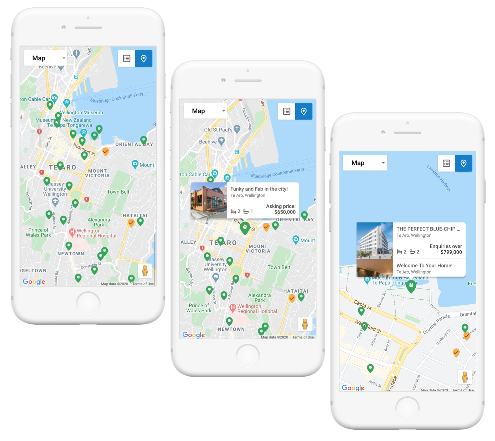
Our members use map search when they’re already looking in an area & want to see what’s nearby. They are also looking at unfamiliar areas and new suburbs to see where they are in relation to landmarks like transport, gyms & shopping centres. I was tasked with designing our map search on our new look to help them find their next property.
I ran user testing with several examples of map searches with customers to learn what their preferences were (and looked at usage data). I ran a card sorting exercise where I asked participants to rank what was important for them to see on a map search. This helped us determine what information to prioritise on the information cards that pop out of the map marker.
While I was doing this research, the developers on my squad were able to add a reusable map component to the new look Trade Me with markers that showed properties as clearly that was an MVP requirement from the initial research. This is an example of how our “dual track agile” approach worked in practice.
Once you’ve got sound research, it gave clear direction as to what to create. For example, when designing the map cards I was able to determine what information was important for a user to be on the map card & was able to make them as small as possible so they could see other surrounding properties. I used a simple map marker as that was the preferred option. I also designed a new “watch-listed” pin to help members see their favourite properties.
We also added in some nice to have features as this is important in a slice of MVP to make it a minimum loveable product. One of these was adding a map image to the favourites page because let’s face it, not many people can read map coordinates and know where they are. It was a really simple case but added a lot more value to our members.
Other bits and bobs
I’ve also been involved in continuous improvements to all of our products. Examples of this have included improvements to the afterpay branding, shopping cart, listings, our shipping information in search, helping Trade Me be compliant with new GST regulations & helping our international sellers understand the changes.